Source: Benjamin Hennig
Click image to enlarge
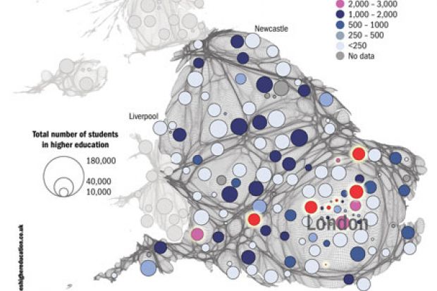
No institution in the North will get the same amount using the same measure, which takes each university’s QR income and divides it by its student population.
The cartogram, produced by Benjamin Hennig, a researcher in the School of Geography and the Environment at the University of Oxford, displays the country adjusted in shape to reflect population density. The circles show how the Higher Education Funding Council for England’s QR funding is distributed per student.
From west to east, the map shows that Oxford, Imperial College London, the Courtauld Institute of Art, the London School of Hygiene and Tropical Medicine, University College London and the University of Cambridge (the red circles) are among those that will each get more than £3,000 in QR per student a year. The University of Bristol, King’s College London, the Royal Veterinary College and Queen Mary University of London (the pink circles) will get between £2,000 and £3,000 per student each year.
Danny Dorling, Halford Mackinder professor of geography at Oxford, said that the concentration of red and pink circles in the South shows a “stark divide” in terms of QR funding.
Register to continue
Why register?
- Registration is free and only takes a moment
- Once registered, you can read 3 articles a month
- Sign up for our newsletter
Subscribe
Or subscribe for unlimited access to:
- Unlimited access to news, views, insights & reviews
- Digital editions
- Digital access to THE’s university and college rankings analysis
Already registered or a current subscriber? Login

